
We follow a user-centric design approach to create intuitive web and mobile interfaces that prioritize usability and engagement. Our focus is on clear information architecture and smooth navigation, ensuring users can easily find what they need. Each design is visually compelling and aligned with your brand identity. Through seamless interaction design and ongoing usability optimization, we enhance user experience at every touchpoint. Our iterative process relies on real user feedback and continuous testing to refine and improve the final product.
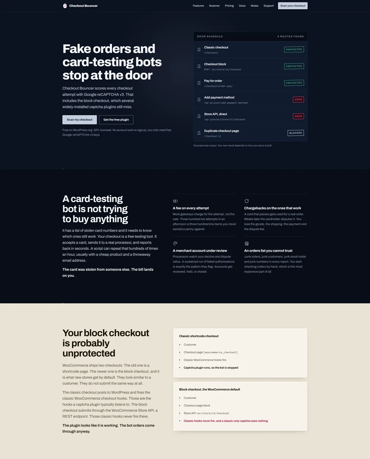
Checkout Bouncer is our own free WooCommerce security plugin on WordPress.org, and this is the WooCommerce plugin website that sells it. Because the people landing on it arrive mid-incident, annoyed and already sceptical of security plugins that promise everything, the usual playbook of shields, threat language and a dashboard floating at fifteen degrees would have read as more noise from the same crowd. Rather than dress it up, we built a purpose-made classic WordPress theme around one idea borrowed from the product itself: a checkout is a door, and this page is the door and its entry-control equipment. Painted steel ground under a single entry lamp, brushed plates with hairline edges, lettering engraved into the panel, verdicts stamped in matte rose rather than glowing.
The complication was that we had nothing conventional to prove the claim with. No install counts, no star ratings, no testimonials, because the plugin had only just launched, and inventing them was never an option. So the hero shows the product doing its job instead: a live example of scanner output listing six routes an order can enter a store through, three protected, two open, one blocked. The proof is the mechanism, not a logo wall.
The build replaced a third-party Extendable block theme with a lean bespoke one. Every page is authored in the block editor, so content can be edited without going near a template, while the theme itself stays classic and light. Every colour is a token declared once at :root, the fonts are self-hosted rather than pulled from Google, and there is no gradient decoration, no glass and no glow anywhere in it. The one radial light source in the hero is the entry lamp, because that is part of the stated world rather than decoration.
The site does more than sell. It carries full product documentation with search across it, so someone hunting a specific setting lands on the right page instead of scrolling a wall of text. We also built a support ticket system into the site, so a store owner can raise an issue and attach the detail we actually need to answer it, rather than opening a forum thread and waiting.
Those forms are exactly the kind of open, public target the product exists to defend, so we protected them the same way the plugin protects a checkout: Google reCAPTCHA v3 scoring every submission in the background, backed by a honeypot field. There is no puzzle and no checkbox. A genuine visitor never sees any of it.
It holds up under measurement. Lighthouse scores the homepage 96 for performance and 100 for accessibility, best practices and SEO on desktop, with first contentful paint at 0.3 seconds, largest contentful paint at 0.4 seconds and total blocking time at zero. That is what self-hosted fonts, no framework and a theme that ships only what the page needs will buy you.
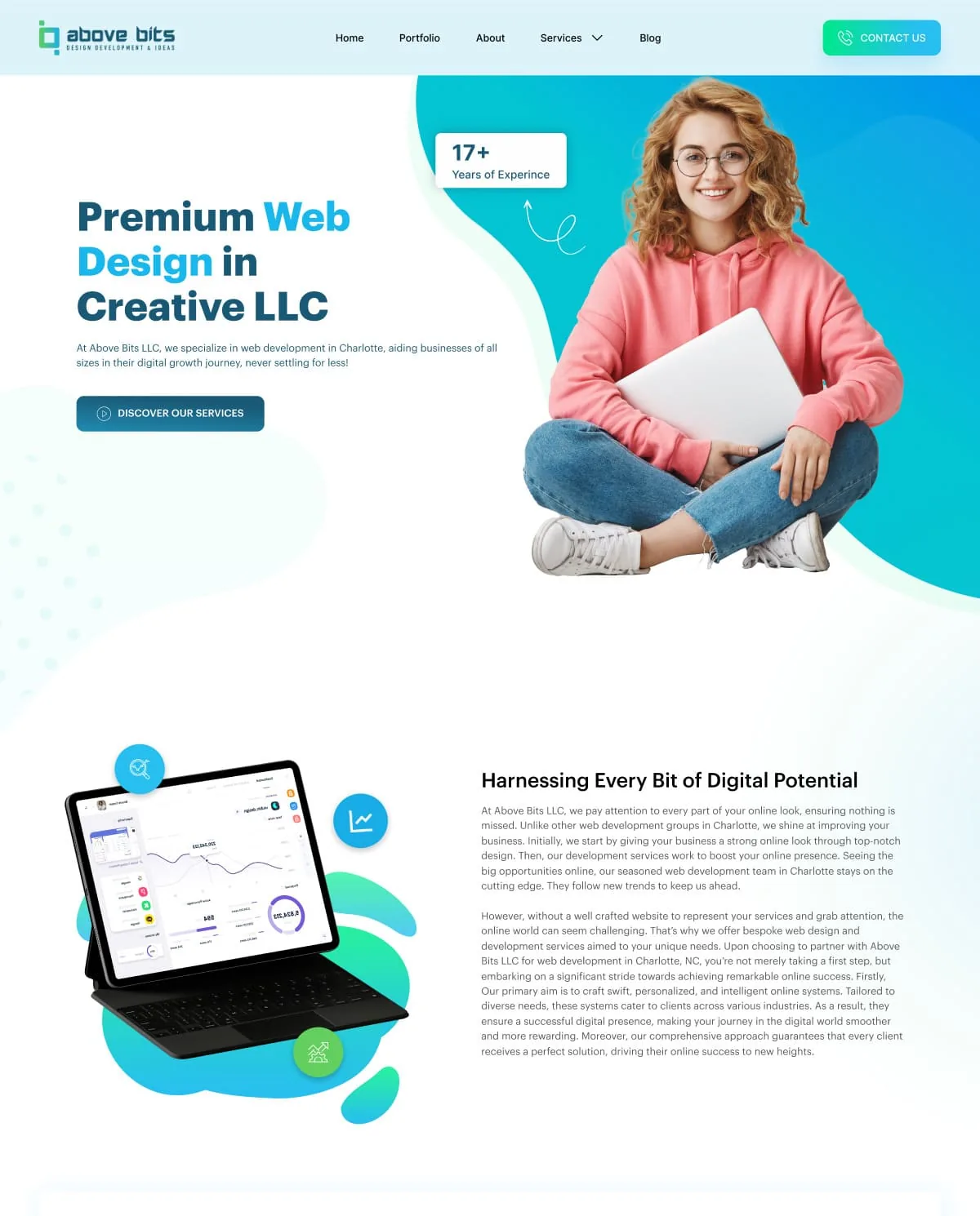
Above Bits hired us to design their website, not to build it. They are a technology and web development company selling to B2B clients, so an IT company website design here had to do something a brochure site never has to: look credible to buyers who can tell the difference. We worked in Figma, with Photoshop for image preparation, and delivered a full home page composition their own engineers could implement.
The goal was a clean, corporate, and trustworthy digital presence that clearly communicates their services and technical capabilities. We structured the layout to guide users through service offerings, project showcases, and contact touchpoints in that order, because a business weighing up a development partner wants to know what you do, see evidence that you have done it before, and then find an easy way to start the conversation. The header carries Home, Portfolio, About, Services, and Blog alongside a standing Contact Us button, so that last step is never more than one click away from any point on the page, and the hero pairs a single positioning line with one call to action rather than competing for attention. Services sits under a dropdown rather than a flat link, because the list behind it is long enough to need a level of its own.
Above Bits write at length about what they do, so the composition had to absorb several substantial blocks of service copy without tiring the reader. We broke them up with alternating text and image sections, a bulleted list of differentiators, and card rows covering their client-focused, adaptable, and results-driven positioning as well as mission, vision, and core values. Long copy stays scannable when the eye is given a new shape to land on every screen or so, which is what that alternation is for.
The visual language runs on a blue and cyan gradient with a green accent, soft organic background shapes, and generous white space, with a floating device mockup carrying the screen imagery that Photoshop prepared. The footer gathers the practical material a technical buyer goes looking for: contact details, company links, the service list, and the platforms and languages the team works in. That technology column alone runs to seventeen entries, from React and Vue through Laravel and Django to WordPress, Magento, and Shopify, so it needed grouping and a lighter type weight to read as reassurance rather than as clutter. The design is fully responsive and optimized for clarity, conversion, and ease of use, and working in Figma meant the developers could read exact spacing, type sizes, and color values straight from the file instead of measuring a flat image, which is usually where a build starts to drift away from what was approved. You can find the company at abovebits.com. For the stage that follows a handover like this one, where an approved Figma design is taken all the way through to a live site, see the wholesale distributor website we built in Elementor Pro.
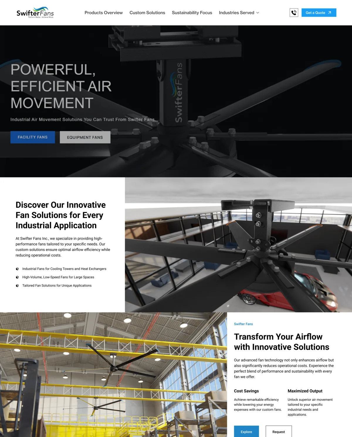
We designed the website for Swifter Fans Inc. The project was secured through Fiverr and involved direct collaboration with the client across several strategy meetings. What they needed was an industrial fan website that reads as engineered rather than styled, and that carries a visitor from a broad airflow problem to a quote request without a detour.
The top-level navigation is Products Overview, Custom Solutions, Sustainability Focus and Industries Served, with Get a Quote pinned to the right of it. The home page follows the same order. It opens on innovative fan solutions for every industrial application, then splits the range immediately into three lines: industrial fans for cooling towers and heat exchangers, high-volume low-speed fans for large spaces, and tailored fan solutions for unique applications. A visitor who already knows which of the three they are can leave the page at the first block.
The middle of the page answers one question, which is whether these fans are worth switching to. A value block pairs cost savings against maximized output. A comparison table sets Swifter Fans against other fans on energy efficiency rating, noise level, and durability and longevity. A sustainability block argues the environmental case without dropping the performance claim, and client feedback runs between them as a rotating quote so that the proof is not all first-party. Every one of those blocks closes on the same pair of buttons, Explore and Request, so the next step never has to be hunted for.
We worked in Figma, with Photoshop for image treatment, and laid the page out for desktop and mobile. The deliverable was the design, handed over for build.
Swifter Fans is online at swifterfans.com. For another site we designed in the same way, for a U.S. manufacturer with a multi-brand catalog, see our website design for Appearance Technology Group.
Tools used: Figma, Photoshop
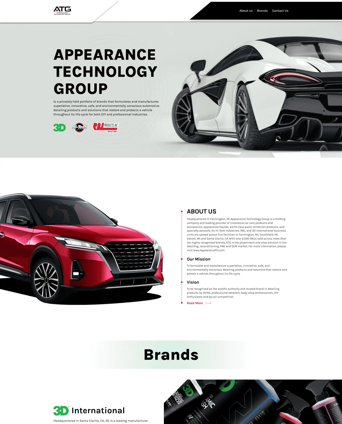
Our team designed the site for Appearance Technology Group, a leading supplier of professional automotive detailing and reconditioning products. The goal was a clean, trustworthy and conversion-focused platform aimed at B2B clients, and we worked it out through multiple client meetings, because an automotive detailing website at group level has to answer a distributor, a professional detailer and an OEM buyer on the same page without making any of them read the other two.
The page opens on the group’s own positioning statement, that ATG formulates and manufactures products which restore and protect a vehicle throughout its life cycle. From there it moves into an About block carrying the manufacturing footprint, the SKU count and the brand count, then sets the mission and the vision out together, with a Read More link keeping the long version one click away instead of on the page. Navigation stays deliberately short: About us, Brands, Contact us.
Below that, a brands block gives 3D International, Hi-Tech Industries and RBL Products a card each, with a short description of what that business unit makes, where it is headquartered, and a link out to the brand’s own website. That structure matters more now than it did then, because the group has kept acquiring: ATG lists six brands today, where the design we delivered carried three.
The contact section asks four things and no more, which are full name, email, company name and the message itself, with an optional tick box for people who want to receive product and content news from ATG, and a short confirmation once the message sends. A newsletter block sits alongside it so that a visitor who is not ready to start a conversation still has somewhere to go, and the footer repeats the three main links next to the terms of use and the privacy policy.
Appearance Technology Group is online at appearancetg.com. For a B2B supply business where we took the work through to a finished build, see our website for National Wholesale Supply, a U.S. plumbing, HVAC and waterworks distributor.
Tools used: Figma, Photoshop
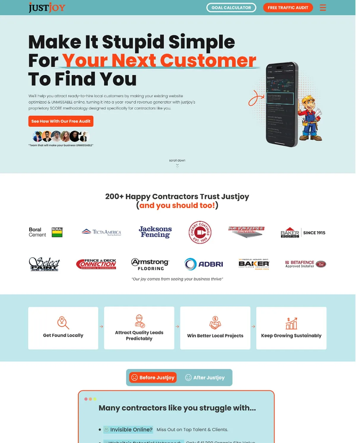
We designed a high-converting landing page for JustJoy, focusing on user engagement and brand clarity. The project came to us through Fiverr and was developed across several collaborative client meetings so that the design lined up with the client’s marketing goals, then laid out for both desktop and mobile.
Every route through the page ends in the same place, a free traffic audit. The header carries two buttons, a goal calculator and the audit; the hero repeats the audit as its only call to action, alongside a phone mockup and an illustrated contractor; and a block further down spells the process out in three steps, which are claiming the free audit, a twenty-five minute Zoom call, and the growth that is meant to follow. Competing offers are what usually leak conversions on a page like this, so there is only one.
A Before Justjoy and After Justjoy toggle sets the problem against the result, listing what the agency says contractors struggle with: being invisible online, a website whose potential is untapped, feast or famine seasons, overwork, and profits that bleed away. Under it, a statistics row and two named testimonials carry the results those clients report, and a trade selector lets a visitor pick roofing, painting, concrete, flooring or other, so that the contractor landing page speaks to their situation rather than to contractors in general.
The page closes on a form that asks for enough to run a useful first conversation: name, business name, business website, email and best contact number, then when the contractor wants to start, estimated annual revenue, and any questions they would like answered on the call. A brand line, a privacy policy and terms of use close the page out underneath it.
The deliverable here was the design itself rather than a build. For another marketing site we designed the same way, see our website design for Appearance Technology Group, a U.S. automotive detailing and reconditioning supplier.
Tools used: Figma, Photoshop