
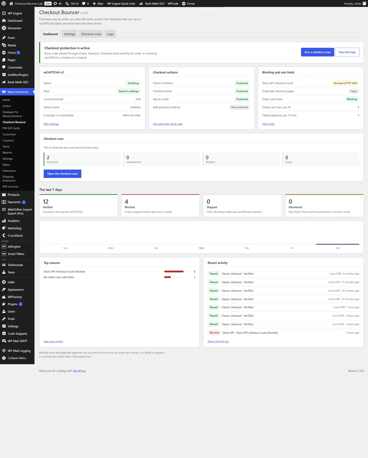
A checkout is the one page on a store that anyone on the internet can submit to, repeatedly, for free, which is exactly why card-testing bots live there. Because most captcha plugins only hook the classic checkout form, they stop working the moment a store switches to the WooCommerce Checkout block. That block does not submit a form at all. It posts JSON to the Store API, and a plugin listening on woocommerce_checkout_process never sees the request. The route stays open even on stores whose visible checkout still uses the classic shortcode, so a bot does not need your checkout page. It only needs the route.
Rather than ship another captcha checkbox, we built the scanner first. Checkout Bouncer opens the store, works out how the checkout is actually rendered, and reports back in plain English. It recognises the Checkout block, the classic shortcode, and layouts built in Elementor, Divi, WPBakery, Beaver Builder, Bricks or Oxygen by looking inside the builder’s own saved layout. It resolves the Store API route, the pay-for-order page and the add-payment-method endpoint, and it hunts down rogue duplicate checkout pages left behind by theme demos and staging copies. Every route it finds carries a severity and a one-click Protect or Block.
The complication was that not every route can carry a token. reCAPTCHA needs somewhere to attach one, and a Store API route hit directly on a store that checks out through the classic form has nowhere to put it. So the plugin registers proper Store API extension data where a token can travel with the order, and where it structurally cannot, it offers to return a 404 or a 403 for that route instead. Store staff and allowlisted addresses are always let through. Detect, protect, block, in that order.
Around that sits a gateway-agnostic order-rate throttle with a monitor mode that records without blocking, an events dashboard with seven-day statistics and CSV export, per-gateway targeting, an IPv4, IPv6 and CIDR allowlist, and fail-open handling so a Google outage does not become the store’s outage. Client addresses resolve from REMOTE_ADDR only unless a filter explicitly opts into a proxy header, so an allowlist entry cannot be reached with a spoofed one. Logging is anonymised throughout: hashed throttle buckets, salted email digests and a daily retention purge.
The result is a WooCommerce reCAPTCHA plugin that treats a checkout as a set of routes rather than a single page, and closes each one on its own terms. We also designed and built the Checkout Bouncer product site and its custom WordPress theme.
For a related caching problem on WooCommerce, see how we fixed a YITH quote counter stuck behind WP Engine cache.
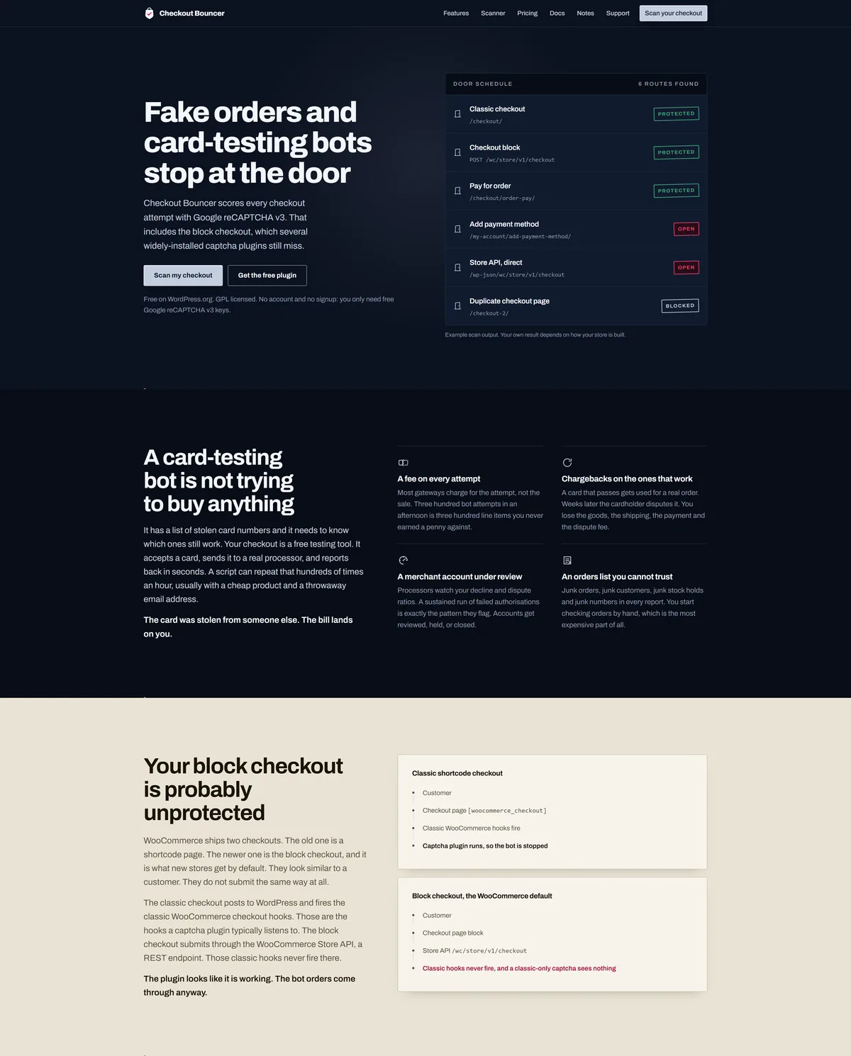
Checkout Bouncer is our own free WooCommerce security plugin on WordPress.org, and this is the WooCommerce plugin website that sells it. Because the people landing on it arrive mid-incident, annoyed and already sceptical of security plugins that promise everything, the usual playbook of shields, threat language and a dashboard floating at fifteen degrees would have read as more noise from the same crowd. Rather than dress it up, we built a purpose-made classic WordPress theme around one idea borrowed from the product itself: a checkout is a door, and this page is the door and its entry-control equipment. Painted steel ground under a single entry lamp, brushed plates with hairline edges, lettering engraved into the panel, verdicts stamped in matte rose rather than glowing.
The complication was that we had nothing conventional to prove the claim with. No install counts, no star ratings, no testimonials, because the plugin had only just launched, and inventing them was never an option. So the hero shows the product doing its job instead: a live example of scanner output listing six routes an order can enter a store through, three protected, two open, one blocked. The proof is the mechanism, not a logo wall.
The build replaced a third-party Extendable block theme with a lean bespoke one. Every page is authored in the block editor, so content can be edited without going near a template, while the theme itself stays classic and light. Every colour is a token declared once at :root, the fonts are self-hosted rather than pulled from Google, and there is no gradient decoration, no glass and no glow anywhere in it. The one radial light source in the hero is the entry lamp, because that is part of the stated world rather than decoration.
The site does more than sell. It carries full product documentation with search across it, so someone hunting a specific setting lands on the right page instead of scrolling a wall of text. We also built a support ticket system into the site, so a store owner can raise an issue and attach the detail we actually need to answer it, rather than opening a forum thread and waiting.
Those forms are exactly the kind of open, public target the product exists to defend, so we protected them the same way the plugin protects a checkout: Google reCAPTCHA v3 scoring every submission in the background, backed by a honeypot field. There is no puzzle and no checkbox. A genuine visitor never sees any of it.
It holds up under measurement. Lighthouse scores the homepage 96 for performance and 100 for accessibility, best practices and SEO on desktop, with first contentful paint at 0.3 seconds, largest contentful paint at 0.4 seconds and total blocking time at zero. That is what self-hosted fonts, no framework and a theme that ships only what the page needs will buy you.
We began the DanDomain to Shopify migration by analyzing the existing DanDomain structure and API limitations. Since DanDomain restricts data retrieval to 100 items per call, we developed a custom API pagination and data caching system to ensure every record (including 6,157 products, 54,227 customers, and 53,380 orders) was securely fetched and stored in a local database.
Once all data was collected, we converted the product catalog into Shopify-compatible CSVs, including variants, SKUs, pricing, media, and metafields. Using Shopify’s GraphQL Admin API, we then recreated the entire category hierarchy, mapping each DanDomain category into a Shopify Collection while optimizing internal linking for SEO.
Next, we migrated all customer accounts and order histories, preserving payment, fulfillment, and transaction details. Each customer profile was imported with accurate contact data, and post-migration password resets were configured for secure reactivation.
We designed and developed a custom Shopify theme based on Adobe InDesign files provided by the client. The goal was to match the original branding while modernizing the experience with:
The new design combined aesthetics with functionality, resulting in smoother navigation, improved user engagement, and higher checkout completion rates.
We implemented Shopify POS for two physical store locations, connecting real-time inventory management and sales reporting. This integration enabled barcode-based checkout, stock synchronization, and unified analytics between online and offline sales.
The migration transformed the DanDomain webshop into a fast, scalable, and growth-focused Shopify store.
Today, the live Shopify store runs smoother, loads faster, and converts visitors into customers more efficiently than ever. This is a complete evolution from DanDomain to a future-ready Shopify ecosystem. For conversion work on an existing Shopify store, see our Shopify conversion optimization for TryMommyandMe.
The full technical write-up, covering the API cap, the collection handles and the redirect map in detail, is our case study on the DanDomain to Shopify migration.
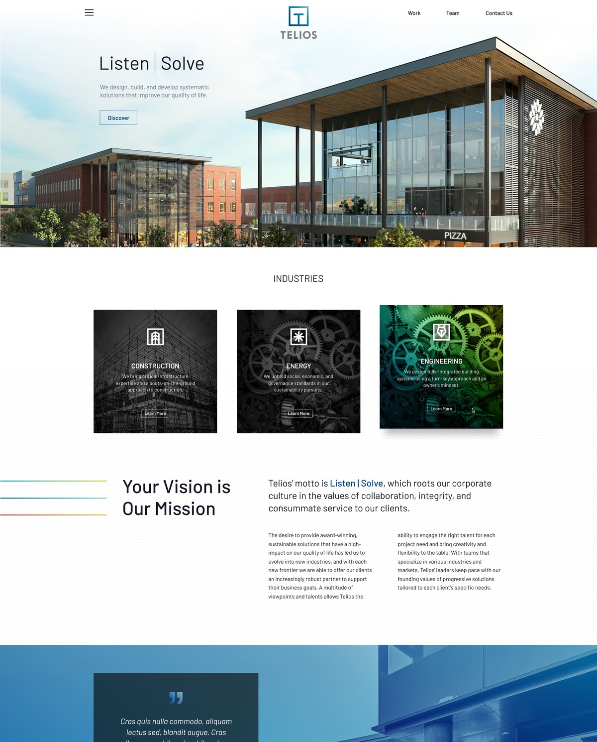
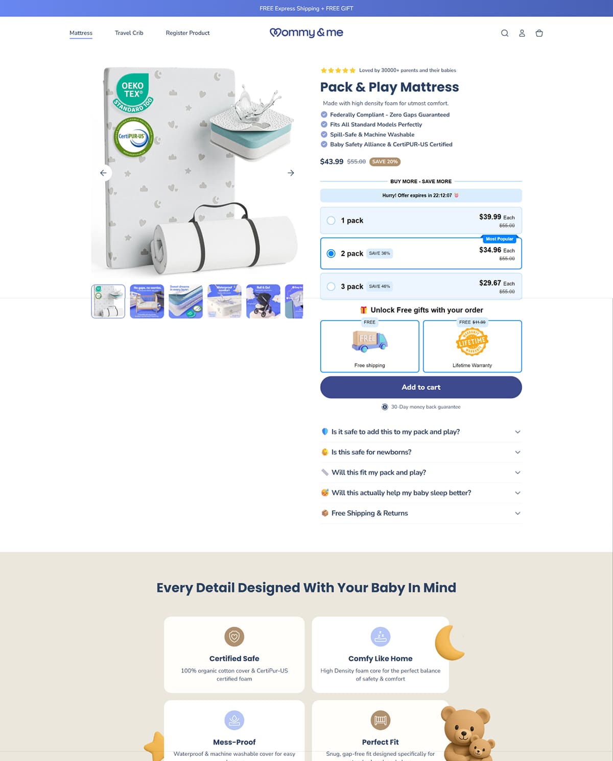
We developed a fully editable Shopify theme that empowered Tom to manage content easily, launch campaigns faster, and scale effortlessly from a provided figma design on the first place. The store was integrated with Klaviyo, enabling automated email marketing flows and customer retention strategies.
For the front-end development, we initially used jQuery to rapidly prototype dynamic layouts and interactions. Once approved, the entire codebase was converted into Shopify’s Liquid templating language for native compatibility, improved performance, and long-term maintainability.
After launch, Tom faced a major challenge: high ad spend with low returns. Our Shopify conversion optimization team analyzed user behavior and made several targeted improvements going beyond the initially provided design to the landing page that delivered remarkable results:
These optimizations led to a 918% increase in conversion rate, a 1,132% surge in total sales, and a 1,242% increase in orders, while boosting the Average Order Value (AOV) to $50, all achieved within the first week of implementation.
The end result was a modern, user-friendly, and high-converting Shopify store that gave Tom complete control over his products, marketing, and analytics, all within one centralized platform.
By combining smart UX design, SEO strategy, and automation, TryMommyandMe transformed from a fragmented online setup into a cohesive, scalable eCommerce brand. For a larger Shopify build with the same emphasis on speed and revenue, see our 7-figure DanDomain to Shopify migration.
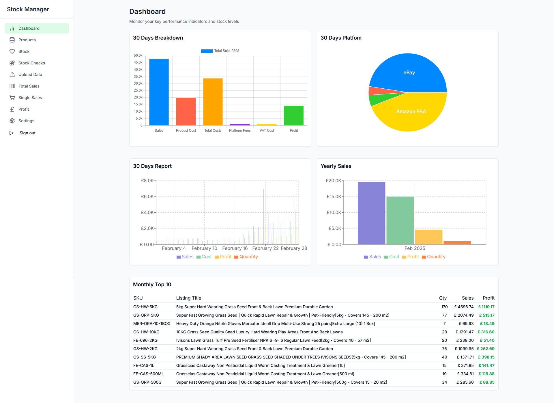
One of our clients named Davvy operates across multiple e-commerce platforms, including Amazon, Shopify, and eBay. Each of these marketplaces has different conditions, rules, and fee structures. The client needed stock management software that could track stock, sales, profit, delivery fees, platform fees, sales profit graphs, product lists, and more in one place.
Previously, the client managed everything using Excel, which became tedious and inefficient. Seeking a better, all-in-one solution, he turned to an AI software builder platform. Using React.js and a PostgreSQL database, he attempted to build the software himself. After hours of effort, debugging, and frustration, he realized the system wasn’t working properly and lacked the “human touch” needed to bring it to life.
Our team took on the challenge of this complex task. The client provided us with the full source code, Excel sheets, product data, and profit calculations. We carefully studied the codebase over the course of seven days to identify the core issues and determine how to enhance the system with additional features.
After 30 days of development, we delivered a working version of the Grassias stock matrix management system. The client reviewed it, requested a few corrections and additional features, which we quickly implemented.
In the end, we built a powerful, all-in-one stock and sales management solution, with every marketplace rule, fee, and margin visible in one place instead of scattered across spreadsheet tabs. The client was extremely satisfied with the result. We also handled Shopify theme development for Grassias to increase sales.
For another build where an external data source drives the site, see our case study on the WordPress Multisite for Het Groene Brein.
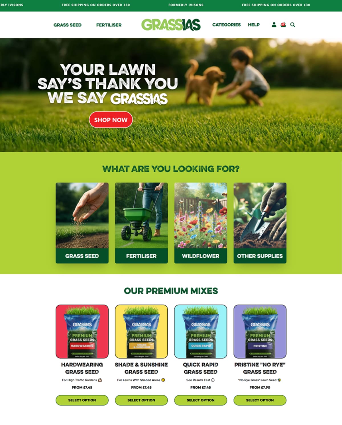
One of our UK clients had a Shopify site named Ivission, which focused on selling field grass seed and fertiliser online. However, the site was generating very few sales. The client approached us to help boost sales. Our team investigated the site and decided to create a new brand, design, and store. The client chose the new brand name Grassias, and we created a UI/UX design inspired by grass field themes.
Once the UI/UX design was finalized, we moved on to development using HTML, CSS, and JavaScript. We incorporated animation effects to reinforce the theme, giving users a stronger connection to the brand. We also developed a calculator that helps users determine the correct ratio of field size, grass seed, and fertilizer. This simplified the process. Users only need to enter the length and width of their home courtyard. In addition to all existing store pages, we developed a dedicated landing page for the user manual, designed specifically for customers who purchase the product through Amazon.
After converting the design to a fully mobile-responsive static version, the client was very pleased. With a few final corrections, we proceeded to build it as a dynamic Shopify theme.
Finally, we took the Shopify rebrand live, migrating the Ivission site to the new Grassias brand. Within one week, sales increased by 50%. The client was thrilled with the results and entrusted us with a new project: developing a Sales and Stock Matrix Management System.
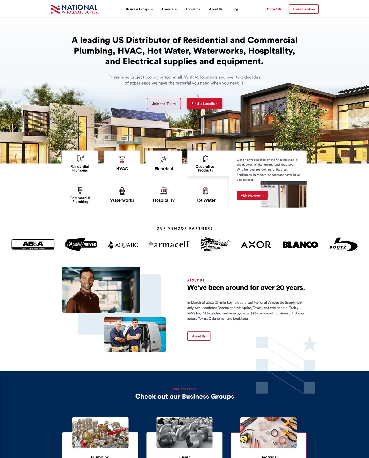
A wholesale distributor website has to do more than describe a company. With nearly fifty branches behind it, this one had to help a buyer find stock near the job. Our primary responsibility was to deliver a fully functional, responsive, and SEO-optimized website based on a Figma design approved by the client. We built the front-end using Elementor Pro on WordPress.
Working from a signed-off design means the build is measured against something exact, so the Elementor Pro work was a matter of matching that reference at every breakpoint rather than reinterpreting it. The result also had to carry a wide range of business groups, from commercial and residential plumbing through HVAC, hot water, waterworks, hospitality, and electrical, without the navigation turning into a maze.
To meet a unique requirement, we developed a custom functionality that allows users to locate the nearest NWS warehouse by entering their location, preferred distance range, and the type of service they are seeking. This feature was implemented using the Google Maps JavaScript API and the Distance Matrix API. For a distributor this is the site’s central job, because a contractor on a deadline does not want a list of branches, they want the one nearest to them that covers the service they need.
Warehouse locations were managed using a custom post type created via JetEngine, along with tailored meta fields. These locations were dynamically displayed on the front end in various formats, including:
Holding the branches as structured content rather than as ordinary pages means each one is entered once and then appears everywhere it is needed: on the map, in the service-zone filters, and in the distance-based results. Adding or moving a location is a data change, not a rebuild.
We also built a custom post type for recruitment functionalities, so vacancies across the branch network are managed in the same structured way as the locations. We white labeled this for our honored partner BigDCreative. The same WordPress and Elementor stack, on a much smaller scale, sits behind the lash salon website we built with Elementor Theme Builder.

Heart of Texas Lashes were not starting from nothing. They had a studio, a client base, and a booking system that already worked, so this lash salon website was a marketing platform designed to drive traffic to their existing store rather than a replacement for it. Our responsibility was to white-label the site for Dallas SEO Dogs while ensuring the following key deliverables:
Those four points shaped every decision that followed. A beauty site is judged on how it looks within a second or two of loading, and it is far more likely to be opened on a phone than on a desktop, so presentation and speed pull against each other unless the build is kept lean from the start. We compressed the imagery, kept the markup minimal, and held the page weight down rather than relying on caching to disguise it.
The site runs on WordPress with Elementor Theme Builder, which lets the header, footer, and page templates be designed once and reused everywhere, so the look stays consistent as new service pages are added and the salon is never rebuilding a layout by hand. Crocoblock supplied the dynamic pieces, Gravity Forms the contact side, and Yoast SEO the on-page structure, with Google Analytics reporting on what visitors actually did.
The salon manages appointments in Vagaro Salon Software, so rather than building a parallel booking system we integrated the one already in use. Visitors move from reading about a service to booking it without hunting for a phone number, and the salon keeps a single diary instead of two. The finished site is live at heartoftexaslashes.com. The same WordPress and Elementor stack, with a third-party system feeding the front end, sits behind the recruiting agency website we white-labeled for BigDCreative.

We white-labeled this recruiting agency website for BigDCreative. The scope covered the whole front end, from the theme itself through to the live feed of job openings, and it had to hold up for two very different visitors: an employer weighing up a hiring partner, and a candidate looking for their next role.
Our key responsibilities included developing a custom WordPress theme as a child of Hello Elementor, with Elementor Pro and Crocoblock handling layout and dynamic content. A near-empty parent theme keeps the front end light, and it leaves the client with pages they can edit themselves rather than files only a developer can touch. Visually engaging animations were added where they reinforce the reading order, and the structure was SEO-optimized from the start, with Yoast SEO in place and separate pages for diversity recruiting, client services, DE&I consulting, HR consulting, and speaking so that each has a subject of its own to rank for.
The agency runs its pipeline in Loxo, a recruiting CRM and applicant tracking system, so we integrated its job openings into the site via embedded JavaScript. Candidates browse current vacancies and apply without anyone having to copy a role into WordPress by hand, which is the difference between a jobs page that stays current and one that quietly goes stale. Gravity Forms handles inquiries and applications, and Google Analytics reports on what visitors do once they arrive.
Speed was treated as a deliverable rather than an afterthought. We ensured the site loaded in under 2.5 seconds, which on a site that leans on motion means compressing assets properly and keeping the plugin stack disciplined instead of adding weight and hoping caching hides it. Dynamic counter animations bring the headline figures to life as the visitor scrolls, enhancing engagement without costing load time. We took the same approach on the wholesale distributor website we built for the same partner, another Elementor Pro build where structured content and load time mattered more than decoration.
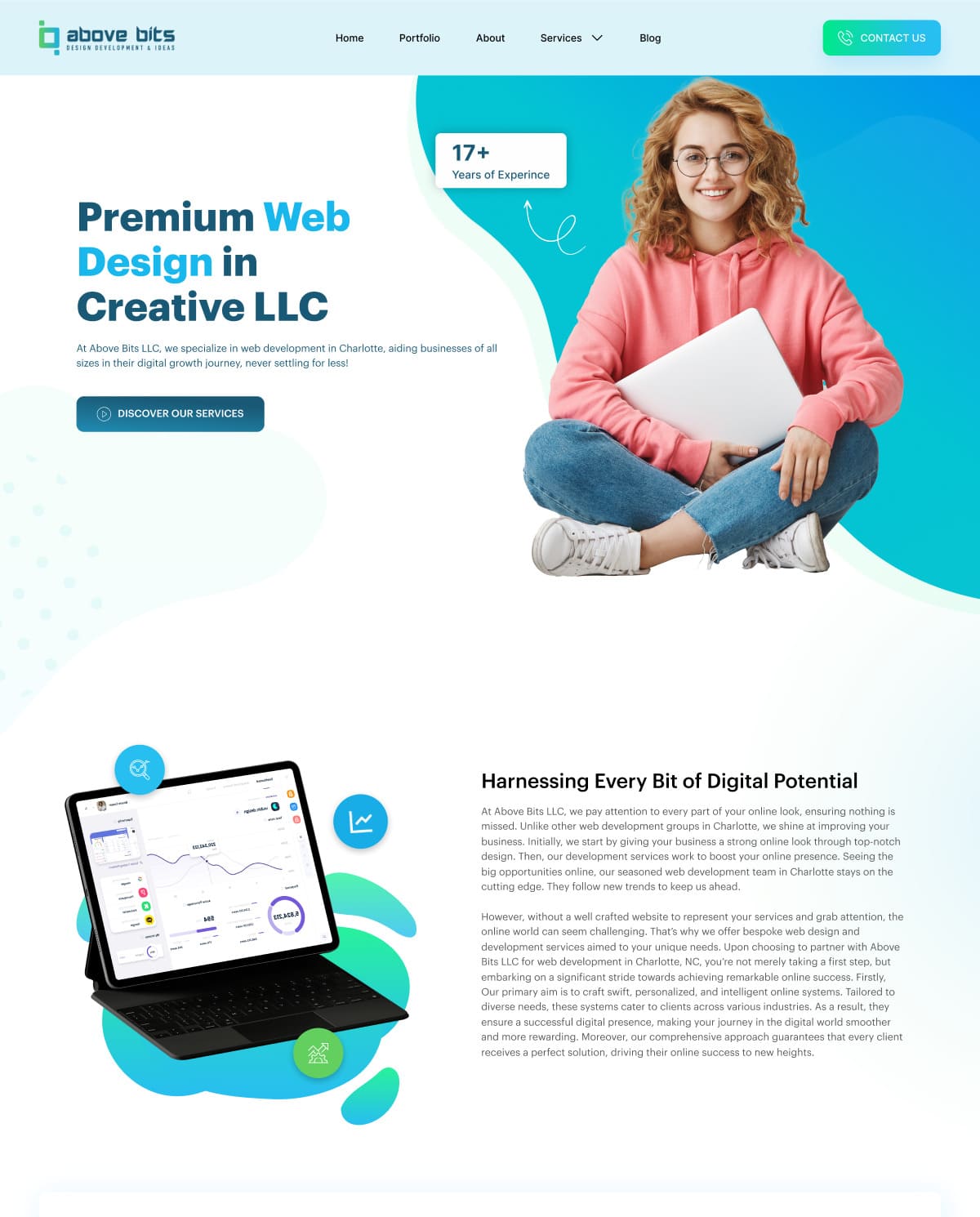
Above Bits hired us to design their website, not to build it. They are a technology and web development company selling to B2B clients, so an IT company website design here had to do something a brochure site never has to: look credible to buyers who can tell the difference. We worked in Figma, with Photoshop for image preparation, and delivered a full home page composition their own engineers could implement.
The goal was a clean, corporate, and trustworthy digital presence that clearly communicates their services and technical capabilities. We structured the layout to guide users through service offerings, project showcases, and contact touchpoints in that order, because a business weighing up a development partner wants to know what you do, see evidence that you have done it before, and then find an easy way to start the conversation. The header carries Home, Portfolio, About, Services, and Blog alongside a standing Contact Us button, so that last step is never more than one click away from any point on the page, and the hero pairs a single positioning line with one call to action rather than competing for attention. Services sits under a dropdown rather than a flat link, because the list behind it is long enough to need a level of its own.
Above Bits write at length about what they do, so the composition had to absorb several substantial blocks of service copy without tiring the reader. We broke them up with alternating text and image sections, a bulleted list of differentiators, and card rows covering their client-focused, adaptable, and results-driven positioning as well as mission, vision, and core values. Long copy stays scannable when the eye is given a new shape to land on every screen or so, which is what that alternation is for.
The visual language runs on a blue and cyan gradient with a green accent, soft organic background shapes, and generous white space, with a floating device mockup carrying the screen imagery that Photoshop prepared. The footer gathers the practical material a technical buyer goes looking for: contact details, company links, the service list, and the platforms and languages the team works in. That technology column alone runs to seventeen entries, from React and Vue through Laravel and Django to WordPress, Magento, and Shopify, so it needed grouping and a lighter type weight to read as reassurance rather than as clutter. The design is fully responsive and optimized for clarity, conversion, and ease of use, and working in Figma meant the developers could read exact spacing, type sizes, and color values straight from the file instead of measuring a flat image, which is usually where a build starts to drift away from what was approved. You can find the company at abovebits.com. For the stage that follows a handover like this one, where an approved Figma design is taken all the way through to a live site, see the wholesale distributor website we built in Elementor Pro.
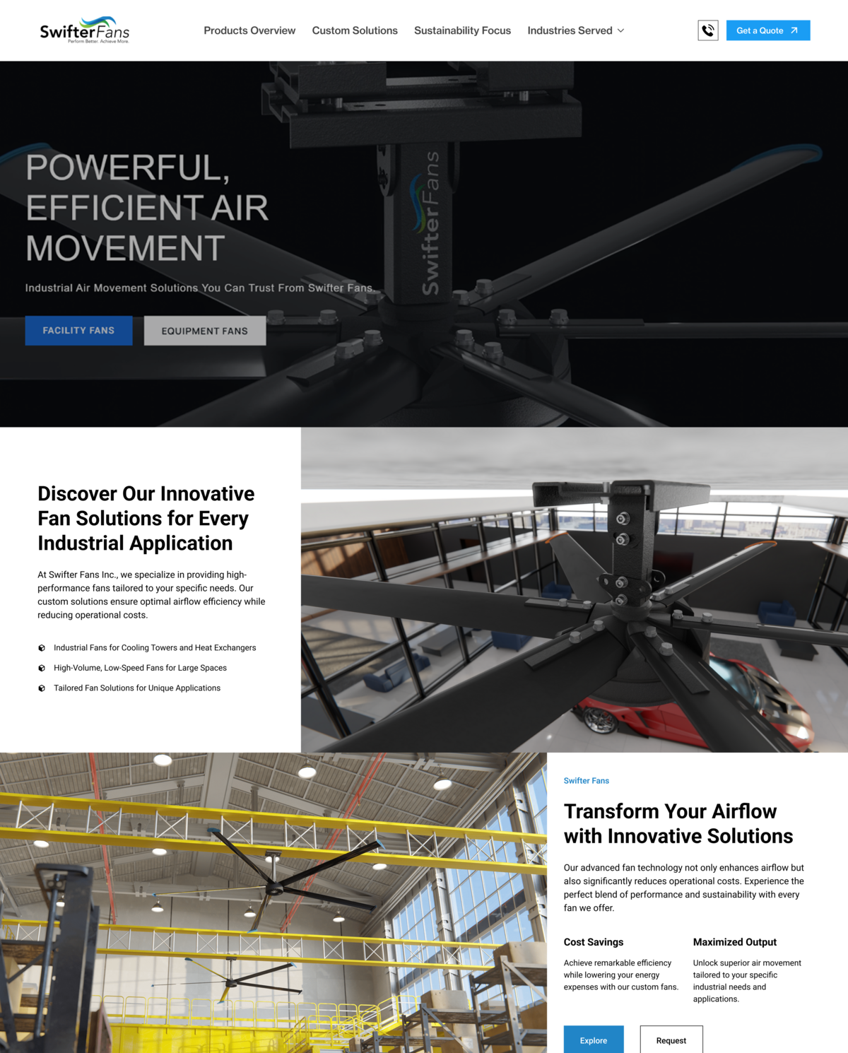
We designed the website for Swifter Fans Inc. The project was secured through Fiverr and involved direct collaboration with the client across several strategy meetings. What they needed was an industrial fan website that reads as engineered rather than styled, and that carries a visitor from a broad airflow problem to a quote request without a detour.
The top-level navigation is Products Overview, Custom Solutions, Sustainability Focus and Industries Served, with Get a Quote pinned to the right of it. The home page follows the same order. It opens on innovative fan solutions for every industrial application, then splits the range immediately into three lines: industrial fans for cooling towers and heat exchangers, high-volume low-speed fans for large spaces, and tailored fan solutions for unique applications. A visitor who already knows which of the three they are can leave the page at the first block.
The middle of the page answers one question, which is whether these fans are worth switching to. A value block pairs cost savings against maximized output. A comparison table sets Swifter Fans against other fans on energy efficiency rating, noise level, and durability and longevity. A sustainability block argues the environmental case without dropping the performance claim, and client feedback runs between them as a rotating quote so that the proof is not all first-party. Every one of those blocks closes on the same pair of buttons, Explore and Request, so the next step never has to be hunted for.
We worked in Figma, with Photoshop for image treatment, and laid the page out for desktop and mobile. The deliverable was the design, handed over for build.
Swifter Fans is online at swifterfans.com. For another site we designed in the same way, for a U.S. manufacturer with a multi-brand catalog, see our website design for Appearance Technology Group.
Tools used: Figma, Photoshop
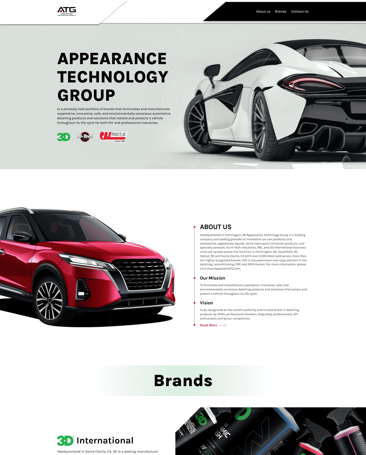
Our team designed the site for Appearance Technology Group, a leading supplier of professional automotive detailing and reconditioning products. The goal was a clean, trustworthy and conversion-focused platform aimed at B2B clients, and we worked it out through multiple client meetings, because an automotive detailing website at group level has to answer a distributor, a professional detailer and an OEM buyer on the same page without making any of them read the other two.
The page opens on the group’s own positioning statement, that ATG formulates and manufactures products which restore and protect a vehicle throughout its life cycle. From there it moves into an About block carrying the manufacturing footprint, the SKU count and the brand count, then sets the mission and the vision out together, with a Read More link keeping the long version one click away instead of on the page. Navigation stays deliberately short: About us, Brands, Contact us.
Below that, a brands block gives 3D International, Hi-Tech Industries and RBL Products a card each, with a short description of what that business unit makes, where it is headquartered, and a link out to the brand’s own website. That structure matters more now than it did then, because the group has kept acquiring: ATG lists six brands today, where the design we delivered carried three.
The contact section asks four things and no more, which are full name, email, company name and the message itself, with an optional tick box for people who want to receive product and content news from ATG, and a short confirmation once the message sends. A newsletter block sits alongside it so that a visitor who is not ready to start a conversation still has somewhere to go, and the footer repeats the three main links next to the terms of use and the privacy policy.
Appearance Technology Group is online at appearancetg.com. For a B2B supply business where we took the work through to a finished build, see our website for National Wholesale Supply, a U.S. plumbing, HVAC and waterworks distributor.
Tools used: Figma, Photoshop
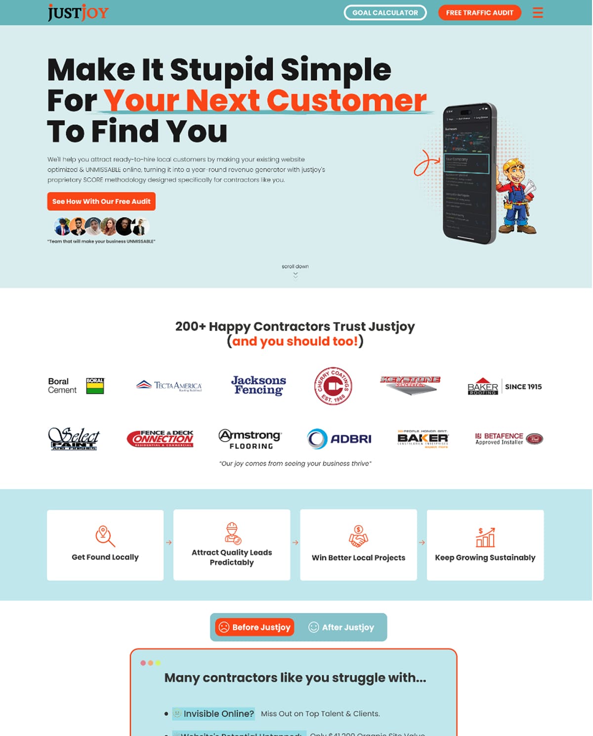
We designed a high-converting landing page for JustJoy, focusing on user engagement and brand clarity. The project came to us through Fiverr and was developed across several collaborative client meetings so that the design lined up with the client’s marketing goals, then laid out for both desktop and mobile.
Every route through the page ends in the same place, a free traffic audit. The header carries two buttons, a goal calculator and the audit; the hero repeats the audit as its only call to action, alongside a phone mockup and an illustrated contractor; and a block further down spells the process out in three steps, which are claiming the free audit, a twenty-five minute Zoom call, and the growth that is meant to follow. Competing offers are what usually leak conversions on a page like this, so there is only one.
A Before Justjoy and After Justjoy toggle sets the problem against the result, listing what the agency says contractors struggle with: being invisible online, a website whose potential is untapped, feast or famine seasons, overwork, and profits that bleed away. Under it, a statistics row and two named testimonials carry the results those clients report, and a trade selector lets a visitor pick roofing, painting, concrete, flooring or other, so that the contractor landing page speaks to their situation rather than to contractors in general.
The page closes on a form that asks for enough to run a useful first conversation: name, business name, business website, email and best contact number, then when the contractor wants to start, estimated annual revenue, and any questions they would like answered on the call. A brand line, a privacy policy and terms of use close the page out underneath it.
The deliverable here was the design itself rather than a build. For another marketing site we designed the same way, see our website design for Appearance Technology Group, a U.S. automotive detailing and reconditioning supplier.
Tools used: Figma, Photoshop

We white labeled this build for Dallas SEO Dogs. Our responsibility was to turn a supplied Figma design into a working theme with Elementor Theme Builder, so that every template on the box truck website, from the home page through to the events archive and the contact page, came out of one design system instead of being rebuilt page by page.
The site runs on WordPress with the Hello Elementor theme, which is a deliberately blank starting point: it carries almost no opinion of its own, so the work done in Elementor Theme Builder is what decides the header, the footer, the page templates and the archive layouts. We rebuilt the client’s Figma file that way, with Elementor Pro and Crocoblock handling the dynamic pieces, Gravity Forms in the stack for form handling, and Yoast SEO and Google Analytics configured on top.
The events calendar needed real structure rather than a page of text. We added a custom post type for events with the matching meta fields, so the client can list an event and let visitors book a place on it, and we put AJAX filtering on the archive so the listing re-sorts without a page reload. The archive still works that way today: the sort control offers title and date, each in both directions, and the results update in place.
We also integrated WooCommerce so the client could sell their books online from the same install, which keeps the shop, the course and the events inside one theme rather than in a separate storefront bolted on beside it.
Box Truck Solutions is online at myboxtrucksolutions.com. We used the same WordPress, Elementor Pro and Crocoblock stack on National Wholesale Supply, a U.S. plumbing and HVAC distributor with close to fifty locations, where the dynamic work was a nearest-warehouse locator rather than an events archive.